Client
Pretty Big Project
Description
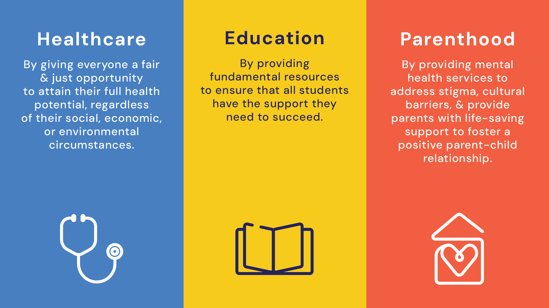
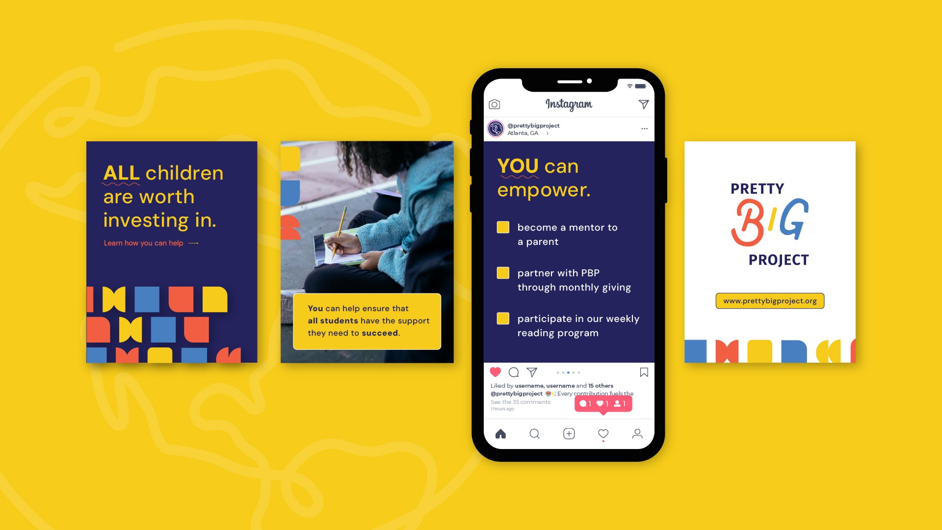
This newly formed non-profit was in need of a brand that reflected their mission of support by starting with local families in the Atlanta metro area while aiming to extend their services globally. The visual identity needs to market to primary audience (donors) and the secondary audience (parents in need of support). The logo imagery is inspired by elementary school craft time. The organic letter forms of “BIG” are created to look as if it were cut out of construction paper.